Difference between revisions of "Tutorial"
m |
m |
||
| Line 394: | Line 394: | ||
| − | + | >> w1 = [[Rebin Functions#Rebin Functions|rebin]](w1, [xlo1, dx1, xhi1, dx2, xhi2….]) | |
| − | >> w2 = regroup(w2, xref) | + | >> w2 = [[Rebin Functions#Regroup Functions|regroup]](w2, xref) |
| Line 401: | Line 401: | ||
| − | + | >> w3 = [[Rebin Functions#Rebunch Functions|rebunch]](w3, nbins) | |
| − | Where '''xref''' is a reference dataset with the required binning. Here dataset w1 will be rebinned with bin boundaries between xlo1 and xhi1 width dx1, between xhi1 and xhi2 width dx2. w2 will be rebinned with the same bins as xref and w3 will have nbins grouped together – if it previously had 400 x values and nbins was 4, it will now have 100 x values. | + | Where '''xref''' is a reference dataset with the required binning. Here dataset '''w1''' will be rebinned with bin boundaries between ''xlo1'' and ''xhi1'' width ''dx1'', between ''xhi1'' and ''xhi2'' width ''dx2''. '''w2''' will be rebinned with the same bins as ''xref'' and '''w3''' will have nbins grouped together – if it previously had 400 ''x'' values and '''nbins''' was 4, it will now have 100 ''x'' values. |
| − | wd2 is a '''''BIG''''' dataset, so lets rebin it so it’s a little smaller. First lets rebunch it’s y dimension by typing | + | '''wd2''' is a '''''BIG''''' dataset, so lets rebin it so it’s a little smaller. First lets rebunch it’s y dimension by typing |
| − | + | >> wd2 = [[Rebin Functions#Rebunch Functions|rebunch_y]] (wd2, 2) | |
| − | See how the size of the dataset changes. We’ve halved the size of the y dimension in our wd2. Ok, now to get wd1 and wd3 compatable with each other. First lets work with wd1 and get it down to a size we can easily see the pixels. | + | See how the size of the dataset changes. We’ve ''halved'' the size of the y dimension in our '''wd2'''. Ok, now to get '''wd1''' and '''wd3''' compatable with each other. First lets work with '''wd1''' and get it down to a size we can easily see the pixels. |
| − | *Lets start by rebunching by 15 in the y dimension | + | *Lets start by rebunching by 15 in the ''y dimension '' |
| − | + | >> wd4 = [[Rebin Functions#Rebunch Functions|rebunch_y]](wd1, 15) | |
| − | >> wd3 = rebunch_y(wd3, 15) | + | >> wd3 = [[Rebin Functions#Rebunch Functions|rebunch_y]](wd3, 15) |
| Line 426: | Line 426: | ||
| − | *Now lets rebin the x dimension in wd1, we wanna look at 200 to 800, so we type | + | *Now lets rebin the ''x dimension'' in '''wd1''', we wanna look at 200 to 800, so we type |
| − | + | >> wd4 = [[Rebin Functions#Rebin Functions|rebin_x]](wd4, [200, 800]) | |
| − | By omitting the dx part, it is assumed we want to keep the same bin widths. | + | By omitting the ''dx'' part, it is assumed we want to keep the same bin widths. |
| − | *Plot wd1 to see what the plot looks like. | + | *Plot '''wd1''' to see what the plot looks like. |
| Line 441: | Line 441: | ||
| − | + | >> wd4 = [[Rebin Functions#Rebin Functions|rebin_x]](wd4, [200,20,800]) | |
| Line 447: | Line 447: | ||
| − | To make wd3 match the binning in wd1, we simply type | + | To make '''wd3''' match the binning in wd1, we simply type |
| − | + | >> wd3 = [[Rebin Functions#Rebin Functions|rebin_x]](wd3, wd4) | |
| Line 457: | Line 457: | ||
*Plot both datasets at once to have a look. | *Plot both datasets at once to have a look. | ||
| − | *Use the color_slider command and look at where you get the most contrast. | + | *Use the [[Other_Commands#Add_a_Color_Slider|color_slider]] command and look at where you get the most contrast. |
| − | You’ll notice you get a good view of wd4 at around the limits 0-180 while wd3 is closer to 0-0.1. That’s a factor of 1800 difference in the upper limit. | + | You’ll notice you get a good view of '''wd4''' at around the limits 0-180 while '''wd3''' is closer to 0-0.1. That’s a factor of 1800 difference in the upper limit. |
==Some [[Binary Operators|Binary Operations]]== | ==Some [[Binary Operators|Binary Operations]]== | ||
| Line 475: | Line 475: | ||
| − | This is an example of the binary operators. You can add, subtract, multiply, divide signal data by numbers. You can also do this with comparable datasets – the errors will be added using error addition methods. So lets have a look at the difference between the datasets by doing | + | This is an example of the [[Binary Operators|binary operators]]. You can add, subtract, multiply, divide signal data by numbers. You can also do this with comparable datasets – the errors will be added using error addition methods. So lets have a look at the difference between the datasets by doing |
| Line 484: | Line 484: | ||
| − | This could be useful in subtracting an estimated background function or comparing a fit to real data. We have 2 slices, data and a fit. | + | This could be useful in subtracting an estimated background function or comparing a fit to ''real data''. We have 2 slices, data and a fit. |
| − | '''''Task:''''' | + | <font {{task}}>'''''Task:''''' |
*Have a look at the difference between the data slice and the fitted slice. | *Have a look at the difference between the data slice and the fitted slice. | ||
| + | </font> | ||
| Line 502: | Line 503: | ||
| − | Now we can take this array away from the signal data. | + | Now we can take this ''array'' away from the signal data. |
Revision as of 16:14, 2 April 2008
Before You Begin
Before you begin the tutorial, you need to download Tutorial_Files.zip. This should be unzipped into a known location. Throughout the course of the tutorial the folder 'C:/Tutorial_Files' will be used. Replace this with the folder name that you have unzipped Tutorial_Files.zip to.
Introduction
What is Libisis?
Libisis is a suite of computer objects and tools for analysing neutron scattering data.
- Fortran Core
- In principle works with data from any instrument on any source, here we’ll look at MAPS, ISIS and Time of flight data though.
- Currently has a Matlab binding
- Some features are Matlab specific – these will be pointed out
- Runs on desktop machines
- Platform independent – if the machine runs Matlab, it should run Libisis.
- Command line driven for flexibility and advanced usage
- Can be used by a user directly or by a higher-level application (i.e. Horace)
- 100’s of commands and many different uses.
The graphics
The graphics package is a powerful addition to the standard Libisis Core.
- Uses the graphics power of Matlab
- Lots of manipulation tools specifically for plotting
- Several different plot types available
- Flexibility and power through Matlab
- Name-Tagging keeps control of what data will plot into which figure window.
Objects of Desire
There are some Libisis objects you’ll find difficult to live without. These are listed below.
IXTdataset_1d
Stores signal and error data against 1 spatial dimension (x). This is analogous to an mgenie spectrum.
IXTdataset_2d
Dataset_2d objects store x,y,signal and error data. An array of IXTdataset_1d objects can be turned into a single IXTdataset_2d object if they have the same x values.
IXTrunfile
Much like an array of IXTdataset_2d objects, except much more information is stored about the instrument, run and experiment. Most things that can be done with an IXTdataset_2d can be done with an IXTrunfile.
IXTdatum
This is a number and error dataset. Used when IXTdataset_1d objects are integrated
IXTdataset_3d
There are currently few manipulation functions for IXTdataset_3d but the ability to plot is available.
Reading In Data
So, we’ve got some data we want to look at using Libisis. You can find this in the Tutorial_Files.zip folder that you should have downloaded and unzipped, we are going to use HET15870.RAW and HET16538.RAW. There isn’t much data of interest there but it’ll do to demonstrate Libisis on it’s own.
We read the raw file into an IXTraw_file object using the command:
>> rawfile1=IXTraw_file('c:/Tutorial_Files/HET15870.RAW');
We can then access information about this raw file using the command geti, for instance to find the number of spectrum we can use
>> Spectrum = geti(rawfile1, ‘NSP1’)
Now lets extract some spectra from the raw file. You can do this with a single spectrum and put it in an IXTdataset_1d (lets take the 25th)
>> w1=getspectrum (rawfile1,25);
Or you can do it for lots of spectra and put it into an IXTdataset_2d
>> wd1=getspectra (rawfile1,[1:500]);
You can even take many spectra and put them into an array of IXTdataset_1d
>> ww=getspectrum (rawfile1,[10:34]);
Note we’re using 2 different but similar looking commands here.
Task:
- Put spectra 401 – 900 of the raw file into variable wd2
There’s a file called HET16538.RAW. You need to:
- Put spectrum 233 into the variable w2
- Put spectra 1-500 into variable wd3
The first thing we want to do is have a quick look at the data to make sure we’ve got the right stuff, we can do this by typing
>> w1
>> w2
>> wd1
>> wd2
>> ww
And get a quick summary of what’s inside, but better still let’s plot them out
 >> dl(w1)
 >> kf
 >> dl(w2)
 >> da(wd1,’name’,’whitebeam vanadium’)
>> da(wd2,’name’,’data’)
Now, look what happens if we type
>> dl(w1)
It replaces our plot of w2! This is how the window handling in Libisis Graphics works…
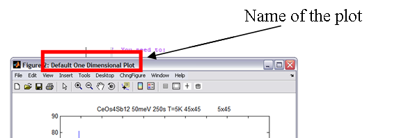
Each plot gets a name and a tag. Tags are all blank by default and there’s some default names for different TYPES of plot used if you don’t name it yourself (i.e. area, surface, oned). The name is the bit displayed at the top of the plot window (see below).
Each name-tag combination takes just one window for itself, so anything you plot using that name-tag combination will replace whatever’s already in there. So when we gave the plot of wd2 a different name to the plot of wd1, it made a new window for itself even though they’re the same plot type (both area).
But using the kf command (“keep figure”) holds a figure. That means that figure wont be used for another plot, ever. Without any arguments, kf assumes you mean the current figure. We could have just as easily typed
>>kf(1)
The commands we typed also demonstrate the property-value pairs used in the graphics. Much like Matlab’s intrinsic set and get commands, the plot commands (and others) take property-value pairs
>> [[Plot Commands#One Dimensional Plotting|dl](object, ‘property1’, ‘value1’, ‘property2’, ‘value2’, ….)
There are plenty of properties you can set outlined in the user manual and reference. We have set the ‘name’ property. We’ll come back to these plots in a second, first lets play a little with the options available to you at the pre-plot stage.
Setting Colours and Styles on 1d Plots
You can set color, markers and lines before you plot. This can be done either globally (i.e. all future plots will take on the properties you set) or locally (only future plots with the input name tags will take on the properties you set). You can set lots of properties at once and the property given to the oned plot will cycle around the options. The best way to see this is to have a play so try typing
>> help [[Pre-Emptive Formatting#Colors|acolor]]
>> help [[Pre-Emptive Formatting#Lines|aline]]
>> help [[Pre-Emptive Formatting#Markers|amark]]
To see what the syntax is, then try setting some global colours, markers and lines, like
>> acolor(‘blue’)
And plot a line (dl) or marker (dm) of w1 or w2 like we did before. Try overplotting with pl and pm.
Try setting multiple colours at once:
>> acolor(‘blue’, ‘green’, ‘red’)
Do some plots and see what happens. Use pl, pm, pe and ph commands too to see what happens and get a feel for it. The first plot in a window always takes the first colour. So the plot methods (dx) always start with the first colour while the overplot methods cycle around the colours (px).
How about just using part of the colour names.
>> acolor(‘blu’, ’blac’, ’r’)
Try some plots. As long as the name is an unambiguous abbreviation, acolor will understand what you mean. How about, just to see, you try entering
>>acolor(‘something’, ‘that’’s’, ‘not’, ‘blue’)
Here you don’t get a full error message. You get a pop-up though, click no. acolor has done its best and set the colour to blue, given you a warning that the other properties are not valid. This means that if you use acolor with your own functions and scripts, it wont halt the entire process just because a bad colour name was given.
Try changing some marker and line properties, you can use several at once here too. It doesn’t matter what order you put thicknesses and styles in either, the software will figure it out.
After doing all of this, reset the global defaults by typing
>> reset_all
Which means everything will return to it’s default in future.
Using Name Tags
Ok, so how about setting some local variables now to get a taste for how the name-tag system can be used. Say we know that in the future, at some point, we’re going to make a plot called “test plot” with the tag “my tag”. We’ve already used red and blue on another plot and want a quick way to distinguish the two. So we want every plot in “test plot”, “my tag” to be green then black. How about we plot w1 and w2 in these new colours. So close any open windows. Now type
>> acolor(‘red’,’blue’)
>> de([w1, w2])
Here we’ve done an errorbar plot of both the datasets at once by putting them in an array. What happens is the first dataset is plotted, then the second is “overplot” on top. It picks up the colours in the order they were entered too. But we’ve got a problem here – we’re too “zoomed out” to see the errorbars! Lets fix this with
>> lx(4600, 4800)
Now we can see a little closer, but our y is still the same height, a little tall for the new x range. To fix this we simply type
>>ly
This makes sure that the height is sqeezed the y limits around the data contained within the x limits. Similarly, on 2d or 3d graphs, lz squeezes the z limits around the data contained within the x and y limits. Typing
>> lx
Will return the limits to fit ALL the data.
<fontcolor="green"> Now a quick task
- Set the colour of all plots with the name “test plot” and tag “my tag” to green then black.
Notice that a window pops up. acolor needs to know if what you entered was correct, since it doesn’t yet know about a plot with that name and tag. Click yes, since you do want to create that name and tag.
- Try changing the marker style of that name tag too so it’s a cross with a medium size.
- Plot markers of the same two datasets using that name and tag.
You should have typed something along the lines of
 >>  acolor(‘test plot’, ‘my tag’, ‘green’, ‘black’);
 >>  amark(‘test plot’, ‘my tag’, ‘x’, 5);
 >>  dm([w1, w2] , ‘name’, ‘test plot’, ‘tag’, ‘my tag’)
- Try changing the GLOBAL colours to red then bluethen green then black and plotting ww using the same name and tag as the last plot.
Changing the global properties changes EVERYTHING, even currently open plots.
All this name-tagging business is much more useful when you’re writing your own applications so you can keep track of windows, set your own defaults etc. etc. So it is useful to know. For the rest of this tutorial we wont use it much though, since it becomes tedious to type out every time!
Two Dimensional Plotting
There’s also plenty to do with 2d datasets so we’d better know how to plot them. They use the same plot controls as their 1d cousins (i.e. property-value pairs, name tags, etc.) but there obviously aren’t as many properties to set for them. At the moment you can’t overplot 2d datasets but you can plot arrays,
try
>> da([wd1, wd2])
wd2 will plot on top of wd1. There’s no averaging, or combining or anything like that. Later we’ll look at methods of plotting arrays but we need to start rebinning etc. first for a much better example.
Try
 >> lx(200, 600)
 >>  ly(100, 150)
 >>  lz
>> lz(0, 0.01)
We could spend a lot of time trying to get a colour scale (incidently lc also changes the colour scale) that shows us all the details, but we might get tired of continuously typing lz(low, high) all day. So how about trying
>> color_slider
This makes life a lot easier. It’s more useful on area plots but can be used on surface plots. Lets try a quick surface
>> ds(wd1)
Here lz and lc are different things, try each one and see what happens.
Multiplot is useful for looking at arrays of IXTdataset_1d objects at once,
try
>> mp(ww)
Now we can see dead detector rows etc. in an instant and compare them to neighbouring ones. If titles and labels are the same in all datasets then they will be used, if not then some default values will be used.
Reading from a slice
There are plenty of other ways to read in data. Some utilities will be described later, but lets read in some slices from mslice, particularly:
>> slice_sim = read_slice(‘tests/400_PSI-45_Qh0p5_sim.slc’);
>> slice_dat = read_slice(‘tests/400_PSI-45_Qh0p5_data.slc’);
It’s that easy, these slices will be used later.
Data Manipulation In Matlab
Ok, we’ve looked at the simple plotting so you can visualise your data. But the power of Libisis lies with it’s ability to manipulate data during and before plotting. From now on we’ll be fiddling with some data and then plotting the results, using the powerful graphics to help us.
First, lets pretend that the each of the pairs of datasets we have are directly comparable. It’s legitimate to add them, divide them, take them away from each other. But unfortuneately they’ve been binned differently, so we’re going to have to sort that out before we start manipulating them.
Some Rebinning
Rebinning can be done in lots and lots of different ways. There are three main commands
 >> rebunch(w, nbins)
 >> regroup(w, [xlo, dx, xhi])
 >> rebin(w, [xlo, dx, xhi])
And of course these all have corresponding functions for 2d rebinning
 >> rebunch_x
 >> rebunch_y
 >> rebunch_xy (wd, [xlo, dx, xhi], [ylo, dy, yhi])
 >> regroup_x
 >> regroup_y
 >> regroup_xy (wd, [xlo, dx, xhi], [ylo, dy, yhi])
 >> rebin_x
 >> rebin_y
 >> rebin_xy
Lots of different commands to remember! Well, just remember that _xmeans along the x axis, _y means along the y axis, _xy means doing both at the same time.
regroup and rebin effectively do the same thing, they change the bins so that they start at xlo, end at xhi and have a spacing dx inbetween. Regroup just makes sure that the bins are always coincident with original bins, the bin width (dx) will be the MINIMUM bin width that will be used.
rebunch on the otherhand bunches nbins together. This is great for data reduction – if you want half as many bins, just rebunch with 2 bins together. You get the same data but at a lower resolution. Simple.
There are also an extraudinary number of different syntaxes you can use with the rebin functions. This is for various historical reasons. We’ll look at the most powerful syntax only. rebin and regroup take the same syntax. You can do one of two things
 >> w1 =  rebin(w1, [xlo1, dx1, xhi1, dx2, xhi2….])
 >> w2 = regroup(w2, xref)
rebunch has just one syntax
>> w3 = rebunch(w3, nbins)
Where xref is a reference dataset with the required binning. Here dataset w1 will be rebinned with bin boundaries between xlo1 and xhi1 width dx1, between xhi1 and xhi2 width dx2. w2 will be rebinned with the same bins as xref and w3 will have nbins grouped together – if it previously had 400 x values and nbins was 4, it will now have 100 x values.
wd2 is a BIG dataset, so lets rebin it so it’s a little smaller. First lets rebunch it’s y dimension by typing
>> wd2 = rebunch_y (wd2, 2)
See how the size of the dataset changes. We’ve halved the size of the y dimension in our wd2. Ok, now to get wd1 and wd3 compatable with each other. First lets work with wd1 and get it down to a size we can easily see the pixels.
- Lets start by rebunching by 15 in the y dimension
 >> wd4 = rebunch_y(wd1, 15)
 >> wd3 = rebunch_y(wd3, 15)
- Take a look at the plots
- Now lets rebin the x dimension in wd1, we wanna look at 200 to 800, so we type
>> wd4 = rebin_x(wd4, [200, 800])
By omitting the dx part, it is assumed we want to keep the same bin widths.
- Plot wd1 to see what the plot looks like.
It’s still got quite a small bin-width, lets increase this width
>> wd4 = rebin_x(wd4, [200,20,800])
Now we can see some individual pixels. Ok, so they’re pretty meaningless, but it’ll show us how libisis works.
To make wd3 match the binning in wd1, we simply type
>> wd3 = rebin_x(wd3, wd4)
Now our two datasets have identical data points, just different signal values.
- Plot both datasets at once to have a look.
- Use the color_slider command and look at where you get the most contrast.
You’ll notice you get a good view of wd4 at around the limits 0-180 while wd3 is closer to 0-0.1. That’s a factor of 1800 difference in the upper limit.
Some Binary Operations
So to get the datasets comparable lets multiply every signal value in wd3 by 1800 (say we knew this was some sort of scaling factor in the data), it’s as easy as
>> wd3 = wd3 * 1800
Or
>> wd3 = 1800 * wd3
This is an example of the binary operators. You can add, subtract, multiply, divide signal data by numbers. You can also do this with comparable datasets – the errors will be added using error addition methods. So lets have a look at the difference between the datasets by doing
>> wd_difference = wd3 – wd1;
- Now plot this and have a look.
This could be useful in subtracting an estimated background function or comparing a fit to real data. We have 2 slices, data and a fit.
Task:
- Have a look at the difference between the data slice and the fitted slice.
Let’s say I have a background for the 1d dataset w2, I know it to be 5 x 10-8X2
So lets build an array of this. First we get the x values from w2 in point form, then create an array of background points.
>> wtemp = hist2point(w2);
>> x = wtemp.x;
>> s_back = 5*10^(-8).*x.^2;
Now we can take this array away from the signal data.
>> w2_dat = w2 – s_back;
Similar things can be done with matricies and IXTdataset_2d objects. See the user manual for details on all the various different ways you can add and take things from datasets.
You can even add a d1d to a d2d or, similarly, a row vector.
Integrating Data
Let’s say we think all our datasets in ww should represent the same data, i.e. in a perfect world they would be exactly the same. So to increase our statistics, we want to integrate them all together and divide by the number of datasets.
- First lets look at ww
>> mp(ww)
Spectrums 6 and 25 look like dead detectors so we need to remove 6, but we’ll leave 25 for now.
>> ww(6) = [];
Now convert to IXTdataset_2d
>> ww2d = oned_to_twod(ww);
This has created an IXTdataset_2d object which takes it’s y values at 1, 2, 3, 4, etc. Now if we simply integrate over the y values which have data and divide by the number we have (which is now 23)
>> w4 = integrate_y(ww2d,1,23)/23;
Now we’ve created a 1d dataset which is the integral of ww across all the spectra with data
- Take a look at it.
- Rotate the multiplot of the original data around to see the scale is the same.
You can also expand IXTdataset_2d into arrays of IXTdataset_1d using expand_d1d (simply the reverse of contract). Y values are always ignored in an expand or multiplot.
Now, lets try something quickly.
- Take wd2 and rebin it between x = 10000 to x = 15000 in bins of 50, between 15001 and 20000 in bins of 35.
- Plot this together with wd1 as an area plot
>> da([wd1, wd2]);
Area plots must be separated, but surface plots can be combined or separate.
Try plotting a surface plot by
>> ds([wd1, wd2], ‘noxvalues’, 400, ‘noyvalues’, 30)
Data is combined and interpolated between the max and min x and y values. noxvalues and noyvalues gives the number of x and y values to use between these points. They are equally distributed.
Now try
>> ds([wd1,wd2], ‘separation’,’on’)
See the difference?
Fitting
Now we can try a fit. This works in 1 or 2 dimensions (currently), we’ll look at 1 dimension first then have a look at two. First to get the data in, it’s stored in a text file in the tutorial files folder named tutorial.txt. Type
>> w_gauss = read_ascii
You’ll get a pop up,
- Read in the data.
- Have a quick look at it.
We’re going to assume this is a noisy Gaussian curve and try and do a best fit. So lets look at fit, type
>> help fit
Now our outputs will be w_fit and params. w_fit will be a dataset with the fitted signal values while params will give us the paremeters used to get to that fit. There’s a Gaussian function called gauss_bkgd which we’ll use to fit the data to.
Lets try [1 2 1 0 0] as our input paramters. We’ll fix the final 2. Now to the left it looks like there’s a lot of noise which could effect the fit. We don’t want to include this so lets remove this range from the fit using the optional argument.
>> [w_fit, params] = fit(w_gauss, @gauss_bkgd, [1 2 1 0 0], [1 1 1 0 0], ‘remove’, [-10,-5])
- Plot the original data in blue ‘+’ markers size 5, then overplot the fit in red line with thickness 2. It fits!
A look at params tells us that p(1) was about 2, p(2) about 3 and p(3) about 2 (the height, centre and standard deviation respectively)
- Give this a title and save this in a file called tutorial_fit
>> write_ascii(w_fit,’tutorial_fit.txt’)
The same idea works for 2d functions.
Using the Homer GUI
Homer is a big part of getting data into Libisis, here's a quick tutorial about how to use the Homer GUI
- Before running the Matlab HOMER GUI make sure that you have read the Instructions to setup LIBISIS and for both the standalone and matlab versions insure you have read instructions on how to setup the GUI, and acted on them.
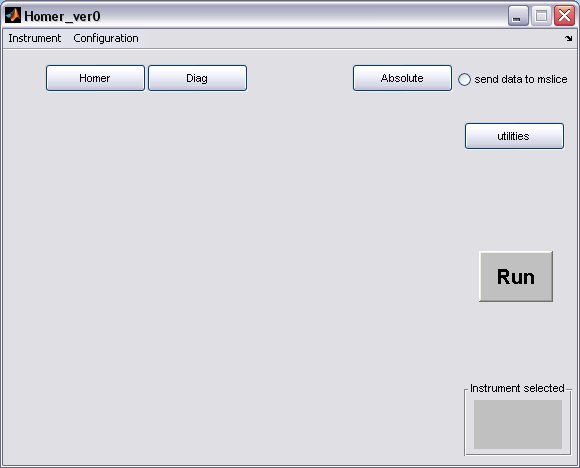
- Homer will start from the matlab command line to bring up a GUI window
>> Homer_ver0
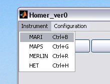
select your instrument using the drop-down menu, this will create the instrument defaults which were defined in the Homer Gui setup
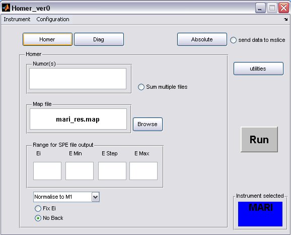
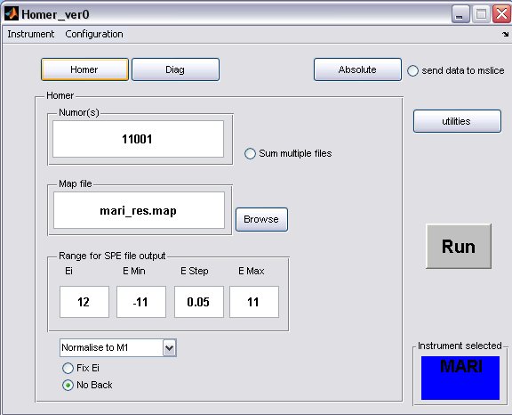
- click on the Homer button to bring up the homer panel
- a) The default map file for the instrument will be filled in, but you can select another one or one you have created using the Map File Format, provided you have placed it in the map file directory.
- b) Fill in energy values for the SPE file output
- c) The Ei will be determined from the run unless the Fix Ei radiobutton is selected
- d) If you want to subtract a flat background from the data then unselect the No Back radiobutton
- A completed Homer panel may look something like this...
- a) multiple runs to be treated with the same parameters can be defined using ',' or ':' to denote discrete or continuous run numbers respectively, for example
11001,11004,11006,11010:11015
- b) when homer is running on an instrument analysis machine an updatestore command in the OpenGenie window will create an INST00000.RAW file (where INST=MAP/MAR/MER) and place it in the relevant instrument data folder, therefore to homer an unfinished run type in 00000 in the run number window
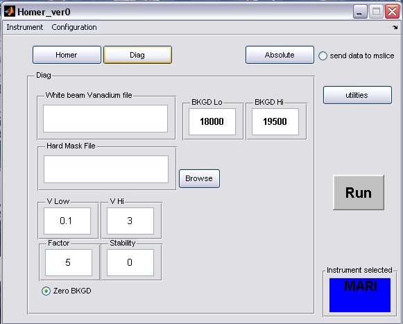
- click on the Diag button to bring up the Diag panel
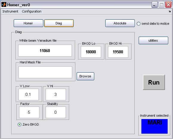
- a) fill in the white beam run numor, and optionally select a hard mask (if there is one for your instrument)
- b) the background limits can also be changed, if you have selected to perform a flat background subtraction on the homer panel, then these are the limits which will be used
- A completed Diag panel may look something like this...
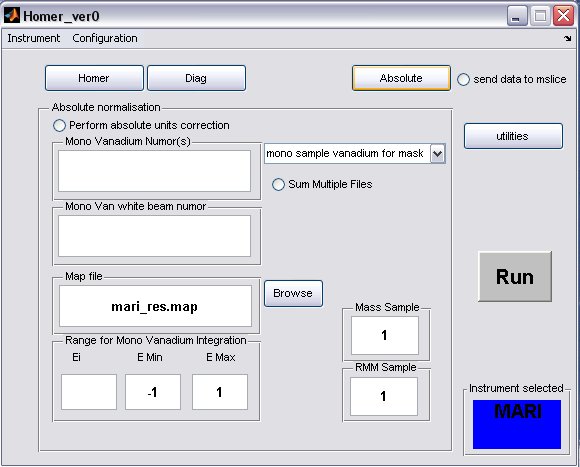
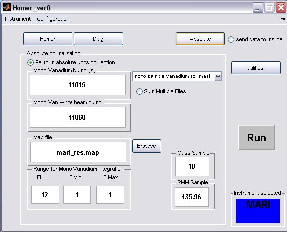
- click on the Absolute button to bring up the Absolute Normalisation panel, absolute normalisation is not selected to be performed by default
- a) Generally the Mono Van white beam numor will be the same as the sample white beam numor, but in special cases for pre PCICP MAPS experiments a diffferent wiring was used for these runs, in this case select the appropriate drop-down menu
and select a different map file.
- b) fill in appropriate Sample Mass, Sample RMM and Ei, if the Fix Ei button was selected on the Homer panel, then the energy will be fixed.
- c) select the radiobutton to perform the normalisation
- A completed Diag panel may look something like this...
- Press the Run button to start the homer process. A progress bar will pop up showing what operation is being performed in the sequence.
Utilities
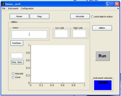
- If you click the utilities button a screen appears. Here you can plot single spectra or summed spectra from the selected RAW file.
a) fill in the run number to use for plotting in the numor box
b) pick a low and high limit for summing spectra together and click the sumspec button
OR
c) enter a single spectra and click disp spectra
- Checking hold plot will hold the last plot and make the next plot a different colour
- Checking zoom allows you to zoom in on the plot
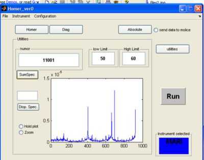
- Result of summing spectra 50 to 60 in RAW file 11001 in the same examples given above:
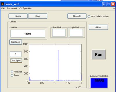
- Result of looking at single spectra 3 in the same RAW file:
Example Scripts
Some example scripts are provided used when scripting homer functions.
Here are some example scripts, use right mouse button => 'Save Target As...' to save the file
Getting Help
typing
>> help function
where function is the function you need help with will give the syntax and how to use the function. Typing
>> gtkhelp
will give a list of graphics functions.
See the User Reference and User Manual for more information
